


site colophon
Aren't I so cool and original for having my "about site" page be called a colophon. It's a little book arts joke. Basically at the end (or the beginning if ya nasty) you put the fonts you used, contributors, and general acknowledgements in the production and publication of the book. This will sort of be the website equivalent.
You are about to be really unimpressed with me but this site was first mocked up in adobe XD. I am easily overwhelmed by the infinite possibilities of web design, especially when it comes to personal sites. I think most people at least make some sort of wireframe anyways. Coding is a pain in the ass. But I use XD for site design for my job so I'm really used to it's workflows and it's comforting banality. When adobe stops supporting it and tries to get me to switch to figma I'm getting a cracked version.
Most of the main layout of this site was mocked up in a single night while listening to P.Y.T. by Michael Jackson on loop. Sound of the summer. The base layout is kind of plain because I plan on going HAM on the internal pages and in the past I kind of focused a ton on the "theme" or a gimmick based around some new coding thing I figured out and then once I moved on from it I didn't always have the energy/desire to completely redesign it and so I didn't want to really look at it anymore. With this layout for the "home" pages I intend for certain details to be more easily updated, switched out, and generally micro-adjusted with the minimal pain and agony and suffering and torture. As of right now, none of this shit is responsive. I'm trying to relax here.
fonts used: headings are Rough71 Becker and paragraphs (and smaller buttons) are Rough51 Becker. I only realized too late that they do not have bold versions built in, so for bolding of the body text I used Rough52 Becker which works well enough. They're from a collection of old digitized fonts that The Font Guy in my design major shared with me. I used Rough Becker series for a lot of stuff, you may have recognized it from my Meet The Artist graphics and other design work.
past layouts (here and elsewise)
I forgot to screenshot a couple iterations but I do have some of my old site designs I did for previous websites:
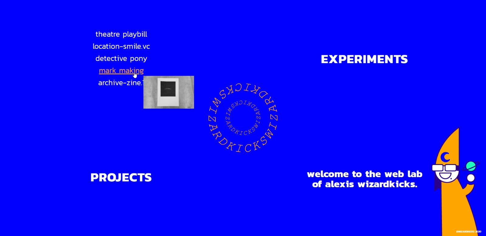
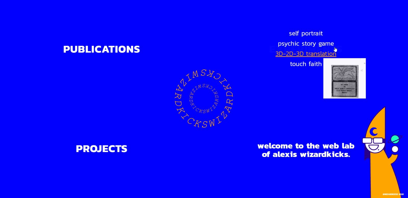
This one was kind of fun. I basically had four flexboxes that filled up the screen with a menu title, and then on hover over each quadrant the menu would appear with different kinds of projects. Then on hover to the link to each project (each one was a custom styled page, you'll see if you check out the links on the sidebar under "soon to revamp") a mini thumbnail would appear. I honestly really liked the thumbnail though it was a PAIN to implement.
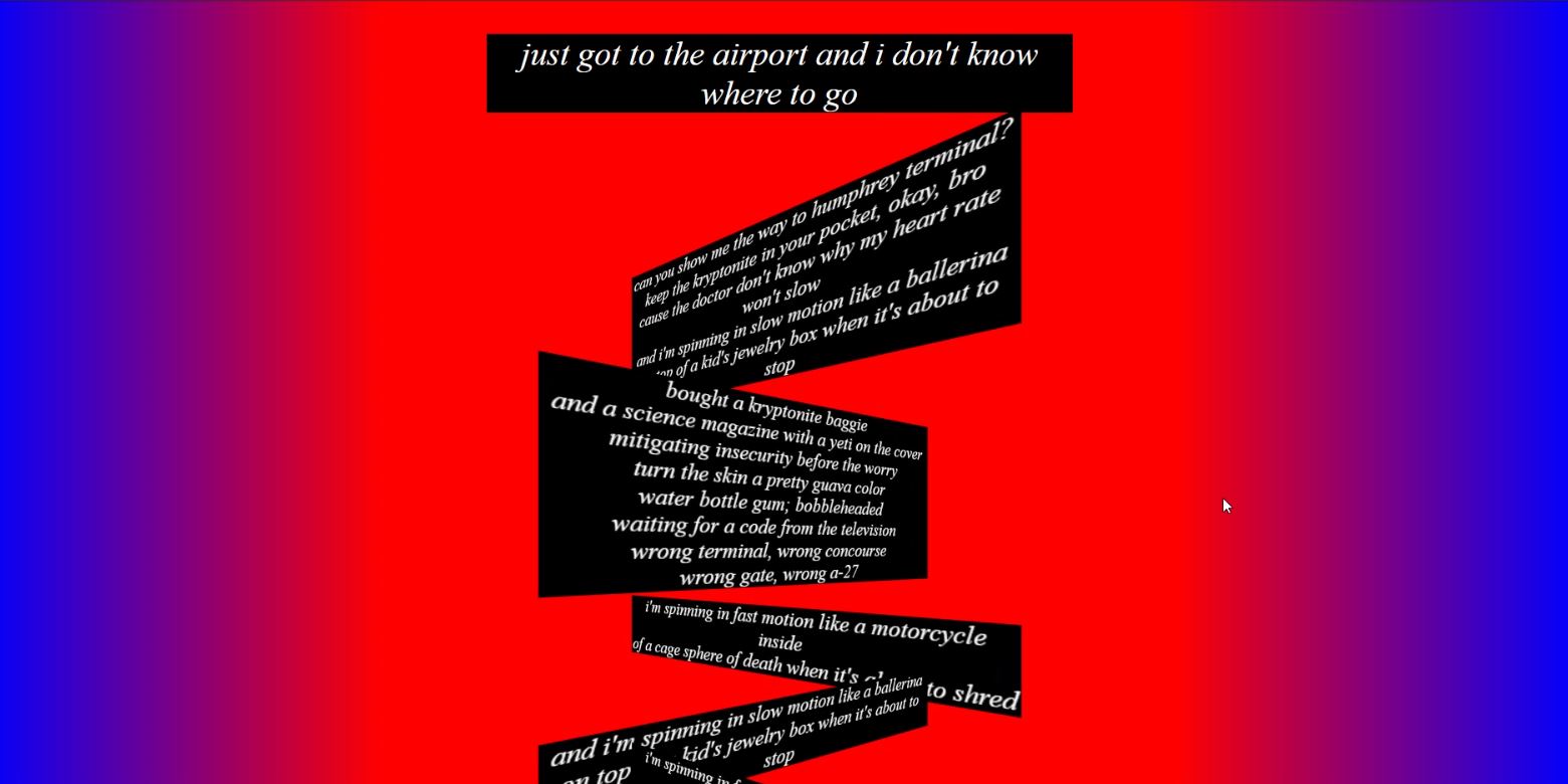
This was one of the first styled webpages I did for my Handmade Web class a couple years ago. The assignment was to take a poem or song (I chose Kryptonite by The Uncluded) and style the text with HTML and CSS. Around that time I saw Carmi doing cool perspective animations in Godhead so I wanted to try it out. On the live page The blocks of text rotated 3d around their center, it was neat.
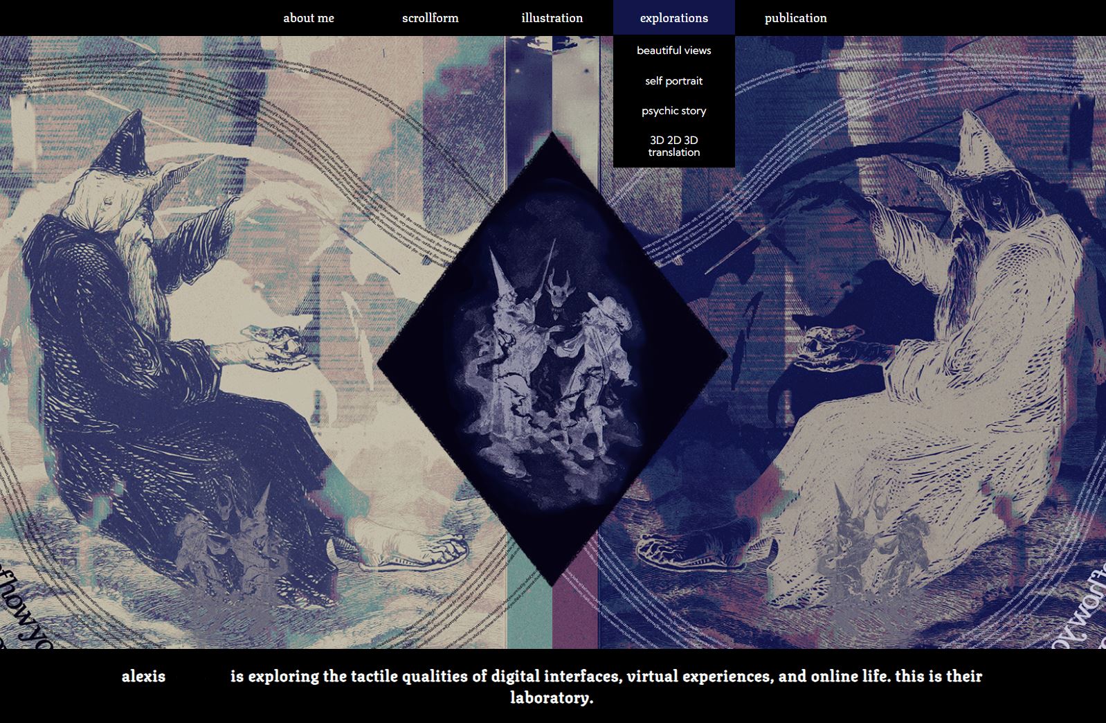
My official portfolio site! I originally had a slider, with the first image being the current one (for fine art), then one with some app design shit I did (I was using it to apply to graphic design jobs), and then an illustration one (I don't know what I was thinking). But then one of my professors told me the other ones were kind of a let down from the first one and I kind of agreed so I just kept it still.
Then had the dropdowns, still going to the separately styled subpages because I have not updated the overall site structure since I first made the website literal years ago. The github folder is still called "class-site". I'm kind of too scared to mess with it so I leave it be. I do plan on redoing the whole thing sometime (soon?) with some sort of CMS equivalent (Jekyll? 11ty? If you think one is better than the other def lemme know).
My main usecase for my portfolio site nowadays is applying to tabling events, and I hate finangling the interior pages of my current site so much, especially with the EXTREMELY jerry-rigged galleries, I just make a new gallery page entirely and link directly. It's in shambles tbh. I want to do a tagging system so I can just have all the images in one place and I don't have to try and make specially curated pages if the theme of an event is different than one I currently have.
What a pain!
